
In recent years responsive web design has become the desired strategy for new and redesigned web sites. Having a responsively designed site presents your business as being modern and cutting edge, while also providing your users with a friendlier user experience. But what exactly is responsive design, and why is it good for business?
What Is Responsive Design?
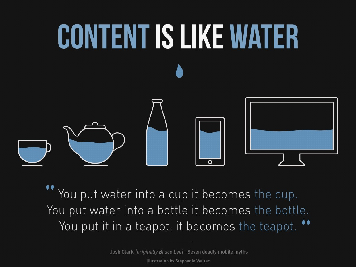
Responsive design is a method of web design where HTML and CSS are leveraged to make your content adapt to the device it is being viewed on. A popular way of thinking of responsive design is: content is like water, and it will flow to fit the form of its container.
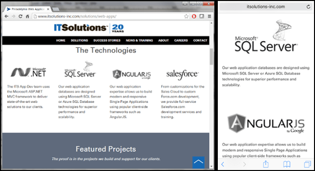
An example of responsive design in action can be seen below in the side by side image of itsolutions-inc.com viewed in a web browser (left) and on a mobile device (right). You can see that when given enough space in a browser the content for the “Technologies” section will fill up the entire screen; however, when space is limited on a mobile device the content blocks will stack on top of each other.
Why is a Responsively Designed Site Good for Business?
So now that you know what responsive design is, why should you consider a responsively designed site for your business?
Improved Search Results
When a web search is initiated from a mobile browser, responsively designed/mobile optimized sites receive a boost in the results list. Currently mobile browsers account for more than 50% of web traffic, so that means half the time a user is searching for you they’re performing that search on a phone or tablet. By designing your site responsively you’ll be giving yourself a better chance of being found.
Better User Experience
Obviously a site designed for a smaller, mobile browser will perform better on said browser than a site that was designed with a desktop in mind. If a user is spending a lot of time zooming and scrolling, chances are they’ll become frustrated and navigate away from the page when they can’t find what they’re looking for; which equates to lost interest in your site, or, worse, your business.
Stronger Branding
For many customers the first interaction they have with your business will be on the web; and as we previously stated, there’s a better than 50/50 chance that that interaction will be on a mobile device. If you are representing your business with an outdated, clunky, hard-to-use web site you could be missing your chance to make a positive first impression. A responsively designed web site shows that your business is modern and up to date.
Greater Maintainability
Years ago, as mobile browsing became more commonplace, the popular method for having a mobile-optimized site was to have a different website (m.yoursite.com) that would be presented to the user whenever a mobile browser was detected. However, that meant you needed two totally separate sites with two totally separate code bases. Any time a change needed to be made it needed to be planned and executed twice; this was a less than optimal use of time. Responsively designed sites have only one code base, which means the days of maintaining two sets of code are over.
Lower Cost
If you are still using an m.site to tackle mobile optimization you’re doing twice as much work than what’s needed. And as the adage goes, “time is money.” So by saving yourself time by only maintaining a single code base you are cutting your costs in half.
When all the advantages of responsive design are considered it makes for an easy decision on which method you should use for managing your web presence moving forward.
Or, if you are looking to have a responsively designed site built for your business contact us today to find out how we can help.
We’ve got answers — fast, clear, and tailored to your needs. Let’s talk tech.
