So you’re looking to create a mobile-friendly, responsive website and have decided on Bootstrap as your framework? Good move. Bootstrap is one of the simplest ways to have built-in, responsive design right out of the box. We are going to run through the steps to get a barebones Bootstrap page up and running in about 10 minutes.
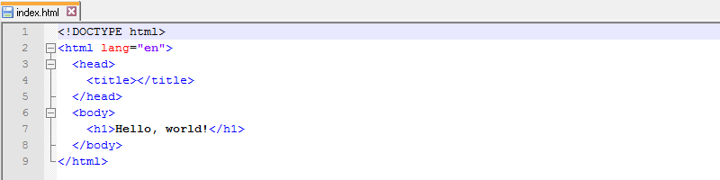
1. Create a blank directory to house your new project, I called mine “bootstrap-test”. In your new directory, use your favorite text editor to create an HTML page containing the minimum elements necessary and save this page as “index.html”. Let’s add a “Hello, World” message while we’re at it:
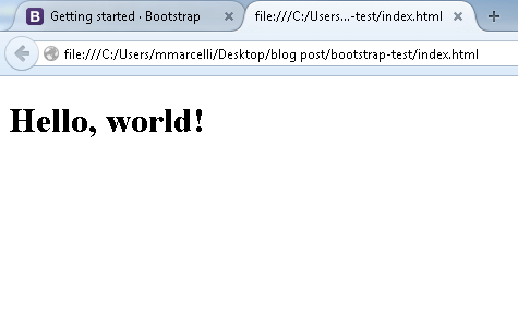
Let’s open our index page in a browser to see how it looks on its own:
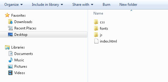
2. Next we need to download the actual source code for the Bootstrap framework. This is available at http://getbootstrap.com/getting-started/#download. If you are in the mood to use the Less or Sass versions, feel free; but for our purposes we are going to download the minified versions of the source documents. A zip folder containing all the necessary files will be saved. Open it up, then copy and paste the entire contents into your project directory; it should now look like this:
3. Now we need to add a few lines to our HTML document to initiate the Bootstrap framework. The highlighted lines below will include the necessary CSS and JavaScript files into your page:
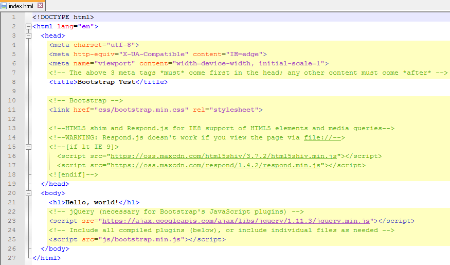
You can copy the full contents of the index.html file below:
<!--The above 3 meta tags *must* come first in the head; any other content must come *after*-->
Bootstrap Test
<!-- Bootstrap -->
<!--HTML5 shim and Respond.js for IE8 support of HTML5 elements and media queries-->
<!--WARNING: Respond.js doesn't work if you view the page via file://-->
<!--[if lt IE 9]>
<script src="https://oss.maxcdn.com/html5shiv/3.7.2/html5shiv.min.js"></script>
<script src="https://oss.maxcdn.com/respond/1.4.2/respond.min.js"></script>
<h1>Hello, world!</h1>
<!-- jQuery (necessary for Bootstrap's JavaScript plugins) -->
<!-- Include all compiled plugins (below), or include individual files as needed -->
4. And that is pretty much it. Congratulations, you’re page is now equipped with Bootstrap and is fully responsive. To illustrate this, let’s reload our page in the browser and see how it looks now:
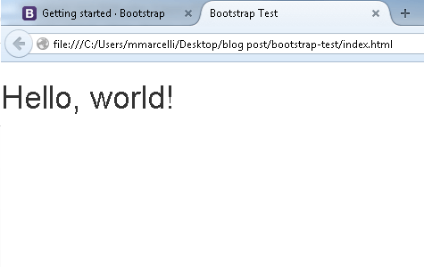
It’s not much, but you can see that the font has changed; that’s because we included, and are now using, the default Bootstrap CSS files.
Bootstrap Framework’s Grid Layout
There are a few points to consider when setting up your grid:
.container (a fixed-width element) or .container-fluid (full-width).col-xs- (extra small, screen < 768px).col-small- (small, screen >= 768px).col-md- (medium, screen >= 992px).col-lg- (large, screen >= 1200px).col-sm- will be applied to not only all small screen widths, but medium and large as wellSo to recap, a grid layout is built as follows: container > row > columns. For a closer look at column classes let’s check out an example.
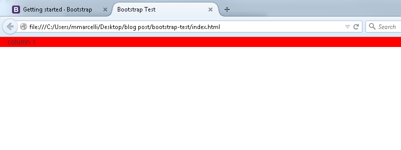
As we saw before, there are 12 available columns; but these can be divvied up and spanned in any combination that adds up to 12 (any combination over 12 will result in overflow kicking down to a new row). So if you want a single column that spans the whole screen on all devices, the code would be:
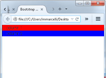
column 1
We only need to use the col-xs- class because it will flow upwards and be applied to all larger screen sizes. Let’s check it out in the browser, I’ve added a background color so that we can better see the column boundaries in a browser.
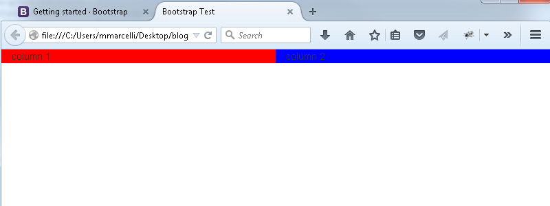
Now, if we wanted two equally sized columns on all devices we would add a second
, and tell each one to span 6 columns (.col-xs-6):
column 1
column 2
Now what if we wanted two equally sized columns for all devices other than the smallest screen width, but we want the columns to use the full screen width when displayed on a phone? We can keep our current layout and just have to slightly tweak the classes to ensure this behavior. To take care of the full width columns we will use the col-xs-12 class on each
, then to ensure that the columns become equal width when the available screen size is > 768px we need to add a second class of col-sm-6. Remember, the column classes flow upwards, so that class declaration will take care of the small screen resolution AND everything above it.
column 1
column 2
If you refresh your browser you’ll see that the grid layout at full width remains the same; however, if you shrink the browser down you’ll notice that the columns stack on top of each other once the resolution gets smaller than 768px.
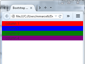
For one more example of how to use the column classes, let’s see how we would implement the grid system if we wanted a different layout for every screen resolution/device size. For this example we’ll add two more
elements (to have four total) and we’ll need a different class for each screen size applied to every
. Our desired layouts will be as follows:
Extra Small: Four columns, each taking up the entire screen width
To accomplish this we tell each
to span all 12 columns, and we’re using the col-xs- class, so our desired class will be col-xs-12
Small: Four equal-width columns
If we have four
elements that should be of equal width, we’ll want them to span the 12 columns equally and so we simply append 3 to the class giving us col-sm-3
Medium: Two equal-width columns in the middle, with two smaller, equal width columns on each end
We’ll have the outer
elements span two columns each, with a class of col-md-2; meaning we have 8 (12-[2*2]) columns left to divide up amongst the inner columns, so each one gets a class of col-md-4. The
elements will flow left to right so the classes should be applied as:
col-md-2
col-md-4
col-md-4
col-md-2
Large: Three minimum-sized columns, with one large column spanning the rest of the screen
Finally we’ll have each of the first three
elements span one column each, and give the remaining nine columns to the last
; meaning our classes are:
col-lg-1
col-lg-1
col-lg-1
col-lg-9
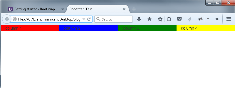
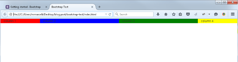
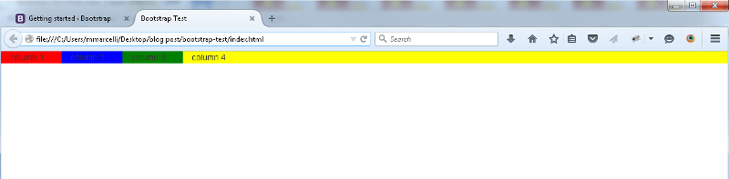
The source code for our grid layout should now look like this:
column 1
column 2
column 3
column 4
And the browser (being resized from extra small to large) will display:
We’ve got answers — fast, clear, and tailored to your needs. Let’s talk tech.